A Painful Sight
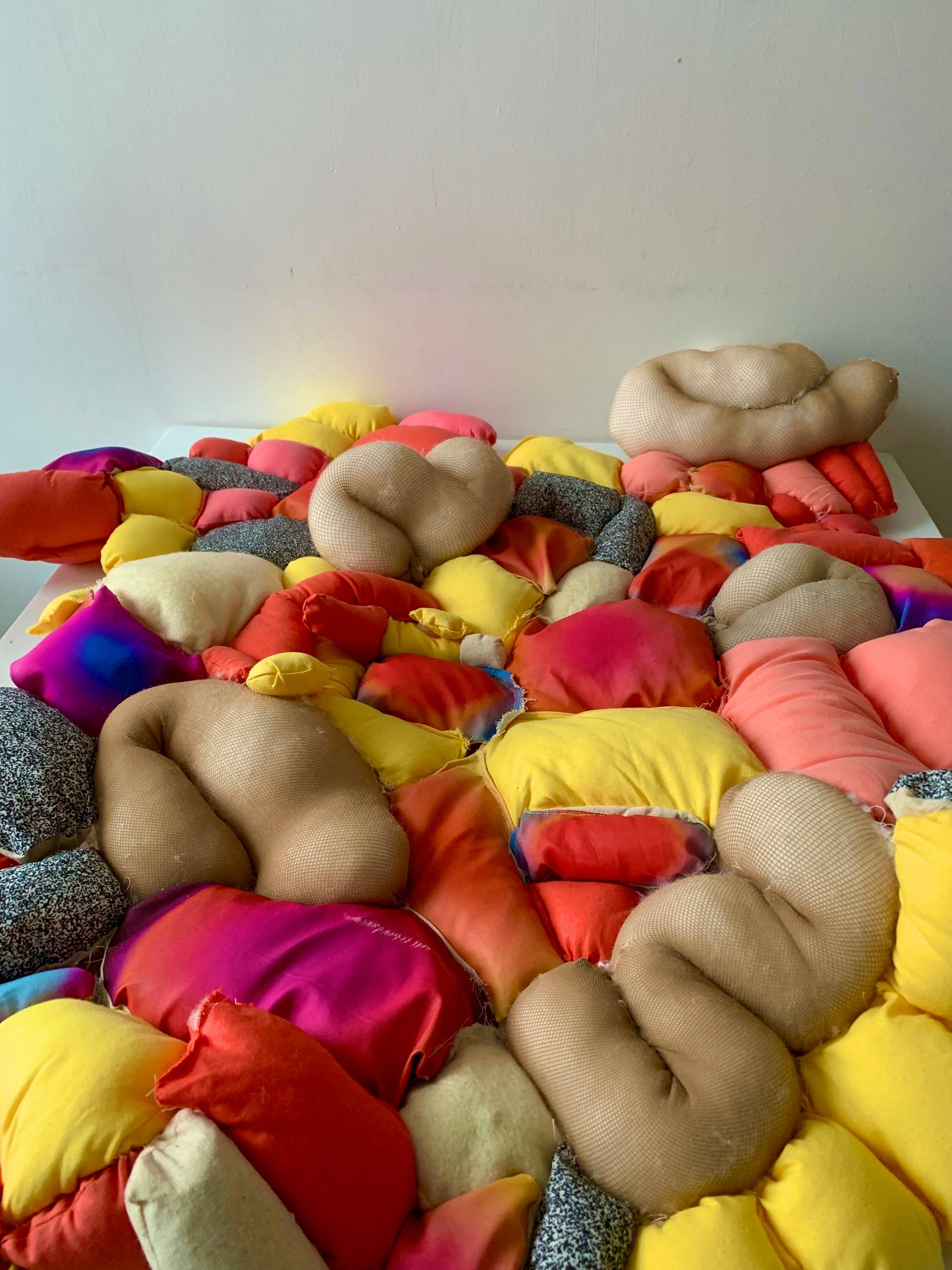
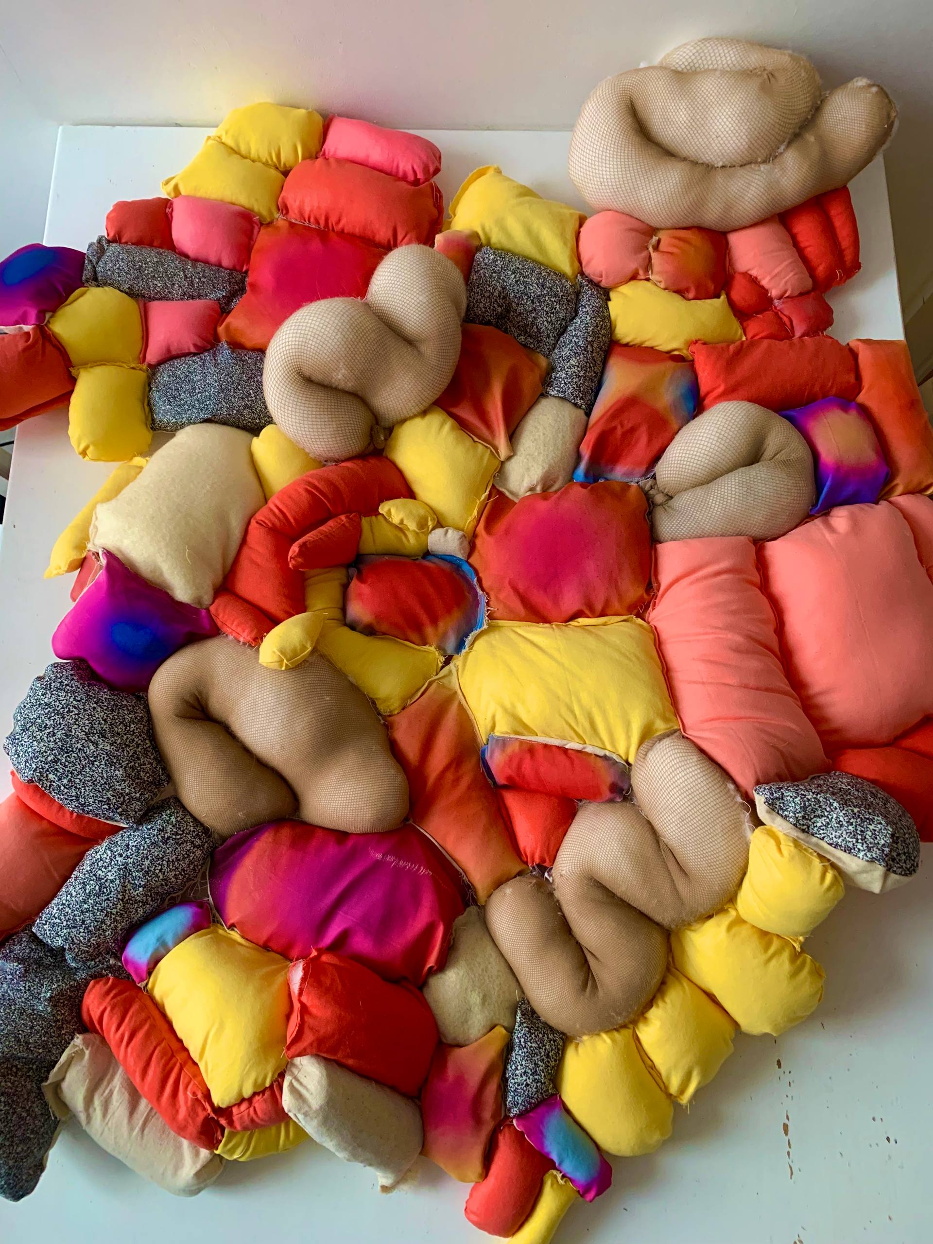
Pain is invisible and also an extremely difficult thing to communicate. This makes for an inevitably difficult interaction between doctor and patient when trying to reach a diagnosis. My project explores new ways of communicating physical pain through taking the hidden sensation and bringing it out into the open through visualising it. The aim here is by making pain visual, empathy and understanding would facilitate doctorpatient interaction. My idea was inspired by the great deal of gender bias that exists within the healthcare system and is about finding ways of overcoming this through re-designing how we communicate pain in ways other than just verbal. After speaking with Alice Gow who has a spinal injury and suffers from chronic pain, I used her visualisations of the injury and of the pain she experiences to determine design decisions on the sculpture. For example, Alice spoke of associating static and migraine aura with her pain which is why some of the fabric is printed with this pattern. A warm yellow colour, as Alice described it, was a strong component of her visualisations of the pain, hence the consistent use of the colour throughout the sculpture. Some of the fabric is filled with sand bags to add a heaviness which was directly inspired by Alices account of a heaviness in her body. The radial gradients came from thinking about ways in which pain is already communicated visually. Often on packaging for pain killers, the pain is indicated by a glowing red orb in the location of injury. The idea also came from weather maps and how they show intensity or severity with gradients of different colours.
j.a.trickey@icloud.com

